Branding & Illustration
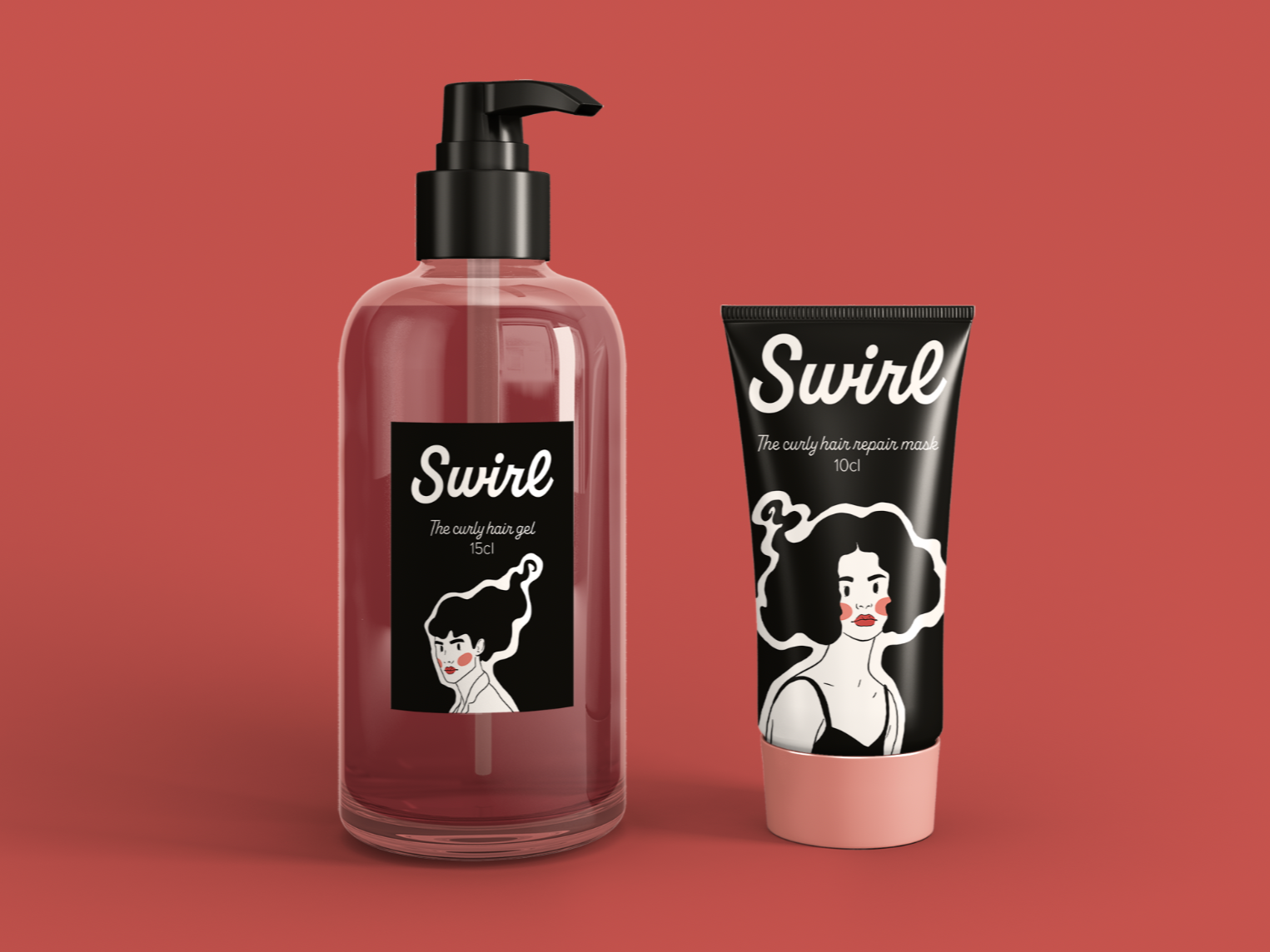
Creating a name and an illustrated brand identity for Swirl, a hair salon and haircare products.
The Process
Research
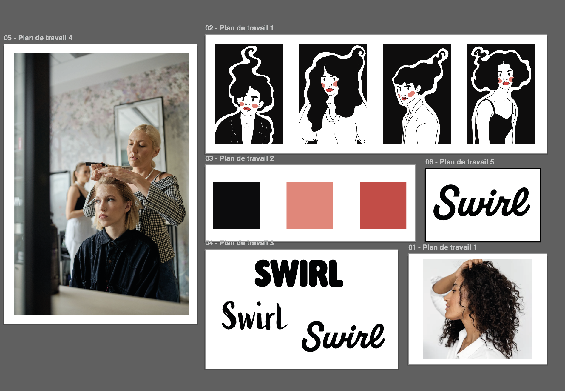
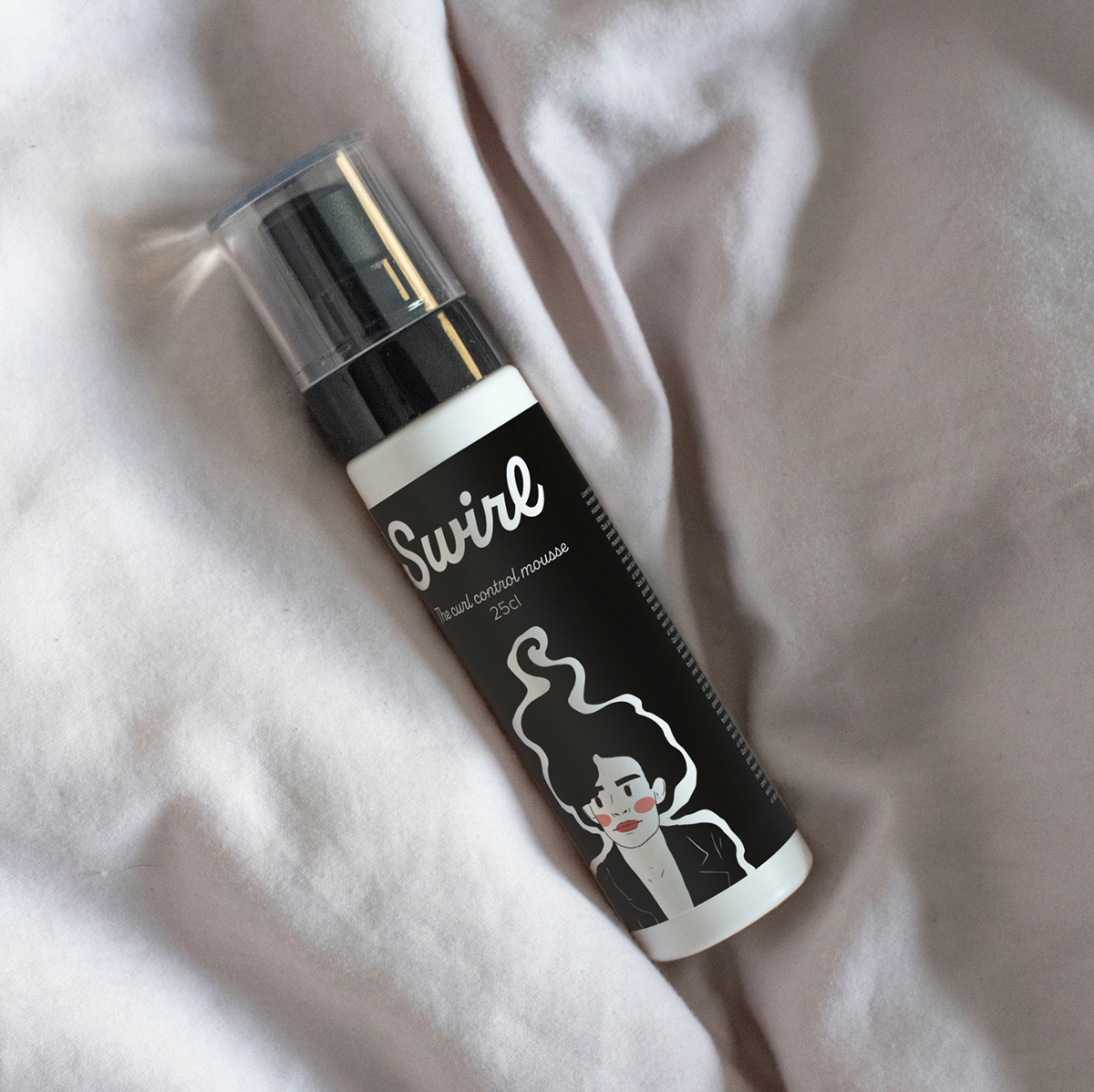
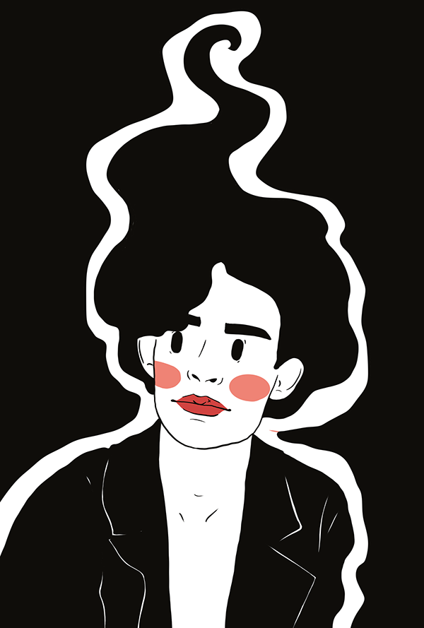
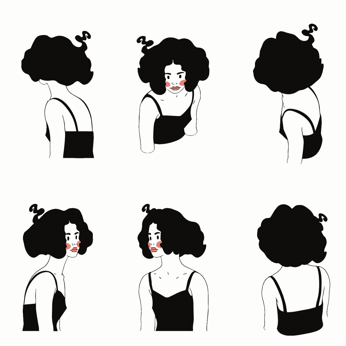
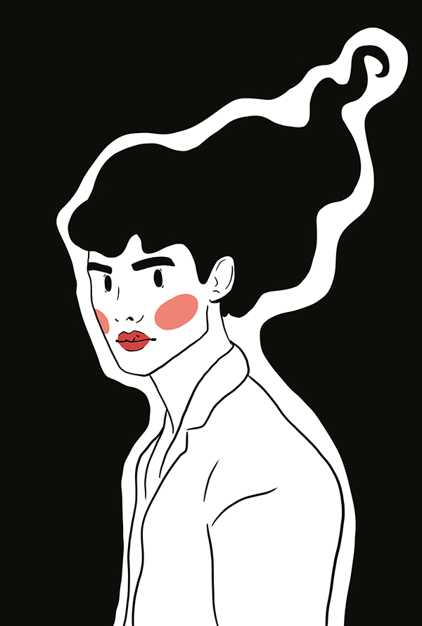
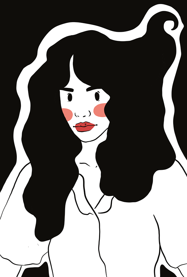
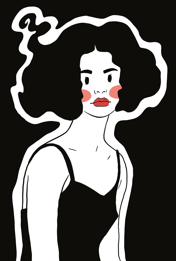
The process began by defining the brand’s core through research, references, and mood boards, establishing a clear visual direction. For SWIRL, the goal was to create a bold, distinctive identity that stands out from typical shampoo packaging. The logo was designed to be simple, recognisable, and scalable. The branding reflects the product’s positioning: creative yet efficient, delivering exactly what’s needed without unnecessary elements. This approach is also visible in the illustrated characters, where bold hairstyles contrast with minimal makeup, reduced to blush and red lipstick, creating a visual language that is direct, noticeable, and impactful.
Step 1
Production
This phase focused on bringing the brand to life. Using insights and tests from the research stage, I created a bold, cohesive visual identity. The final colour palette was defined, and all design elements were adapted to fit various constraints across digital and print formats. Ready-to-use visuals and files were produced, ensuring consistency and flexibility. The logo characters subtly reference hair and curves while remaining modern, “arty”, and full of personality.
Step 2
Step 3
Brand Strategy Recommendations
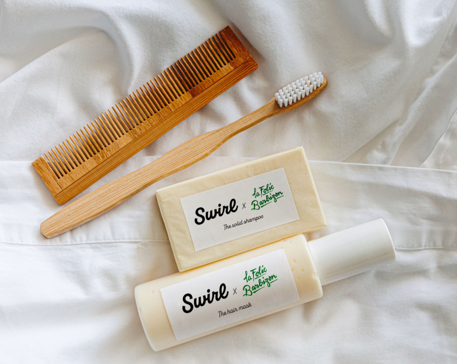
Launching the brand required a clear, engaging communication strategy. The plan included partnering with local hair influencers, offering on-site product testing, hosting educational workshops on curly hair care, and designing limited-edition products in collaboration with hotels and spas. Each initiative was designed to amplify the brand’s presence, connect directly with the audience, and showcase SWIRL’s creative yet efficient identity.
