Branding for small Creatives
Brand identity for two independent creatives: Kel Prod, an audiovisual production company, and Dans Mon Livre, an educational podcast.
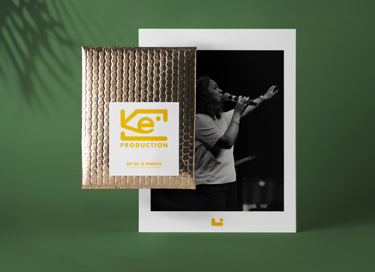
Kel Prod
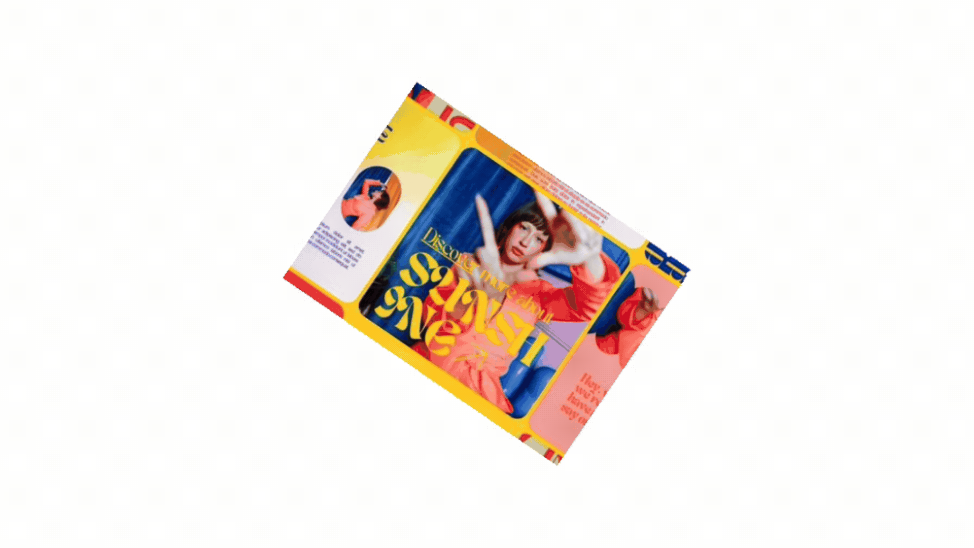
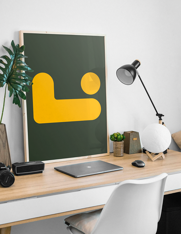
For Kel Prod’s branding, I developed a visual direction built around bright, positive shapes and colours. The logo was designed to be instantly recognisable and highly adaptable across various formats and media.
Research
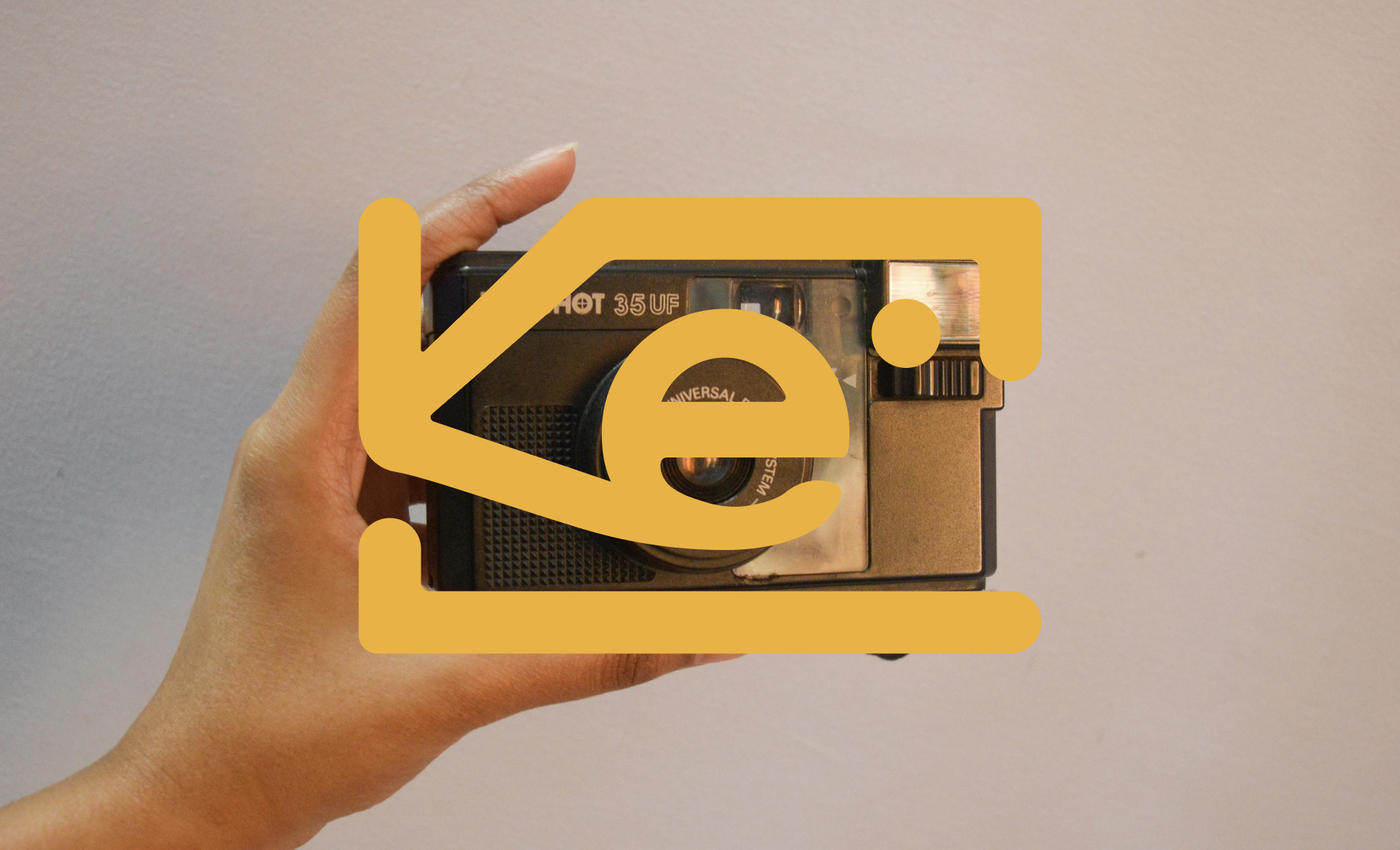
Playful in nature, the logo uses the letters K, E, and L shaped into a portable camera. Its main colour, a bright yellow, makes it instantly noticeable.
The Logo
Cath, the owner of Kel Prod, wanted a bold identity she could use across her visuals to make her work easily recognisable. I took this into account when creating the logo variations, ensuring I provided a coherent and practical range of options.
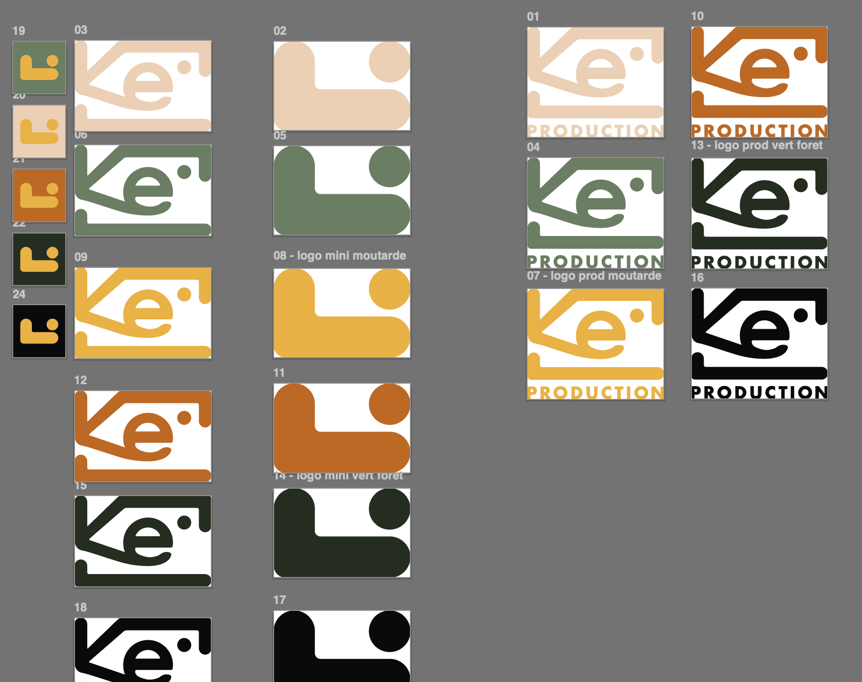
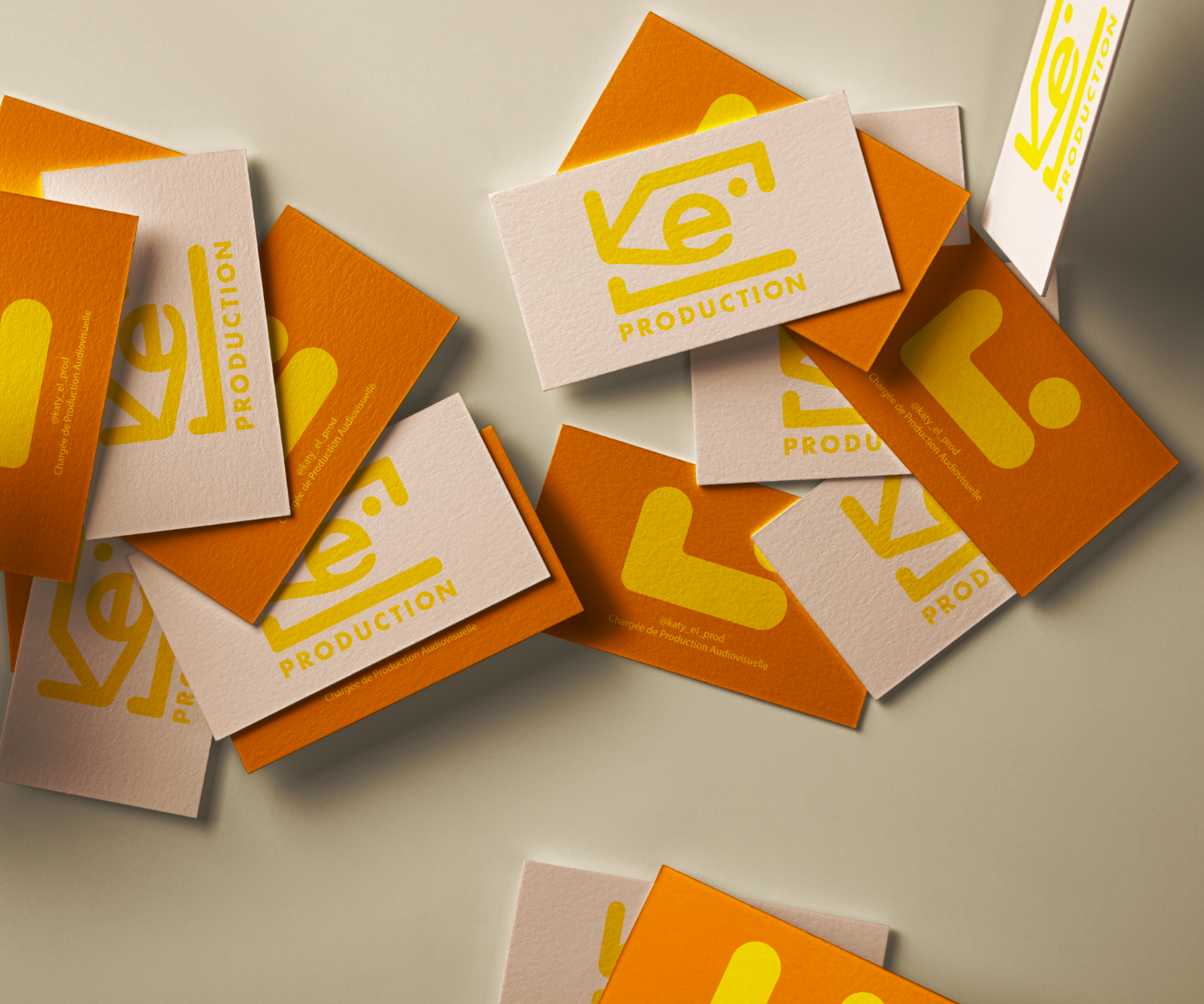
Logo variations
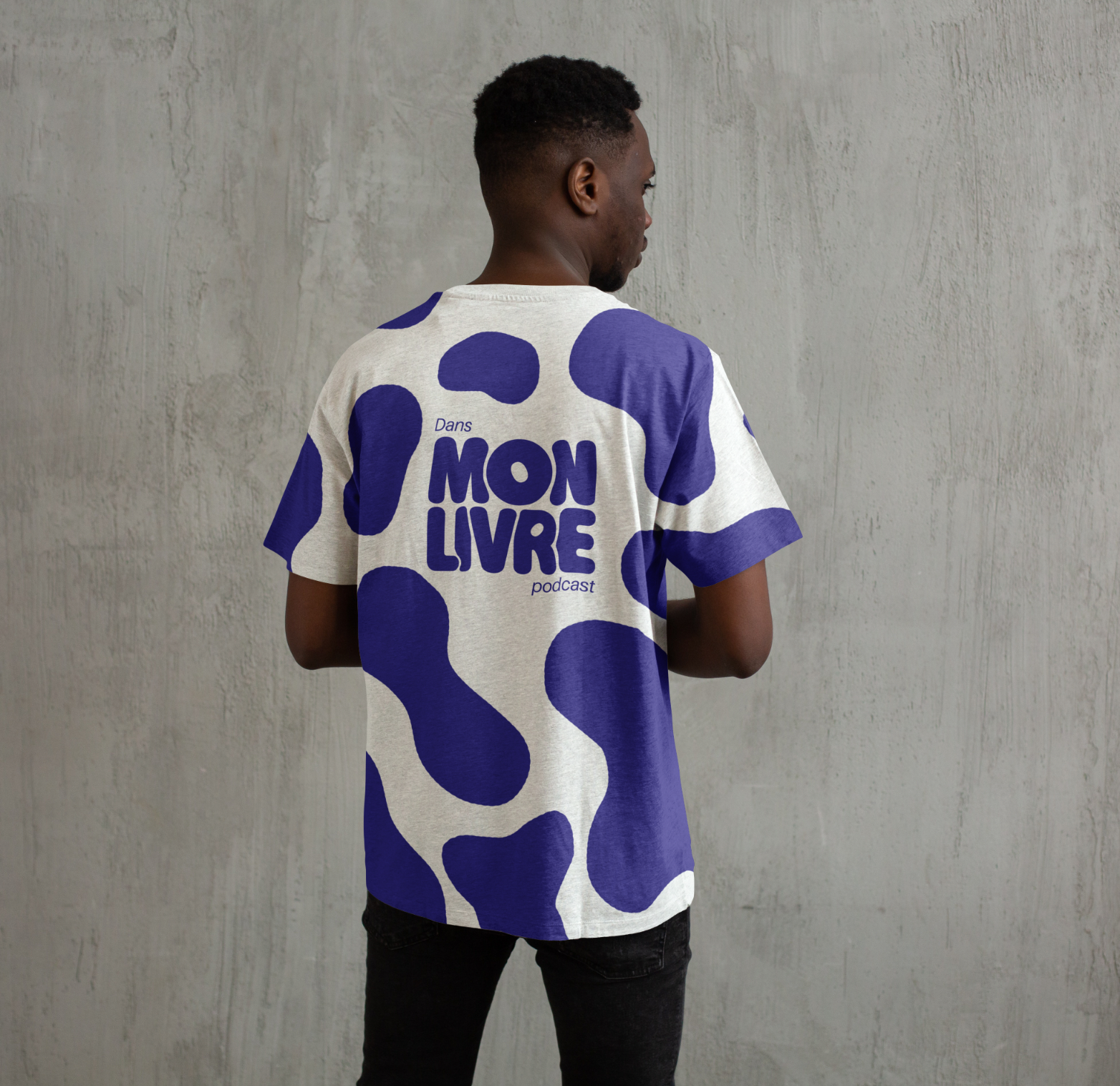
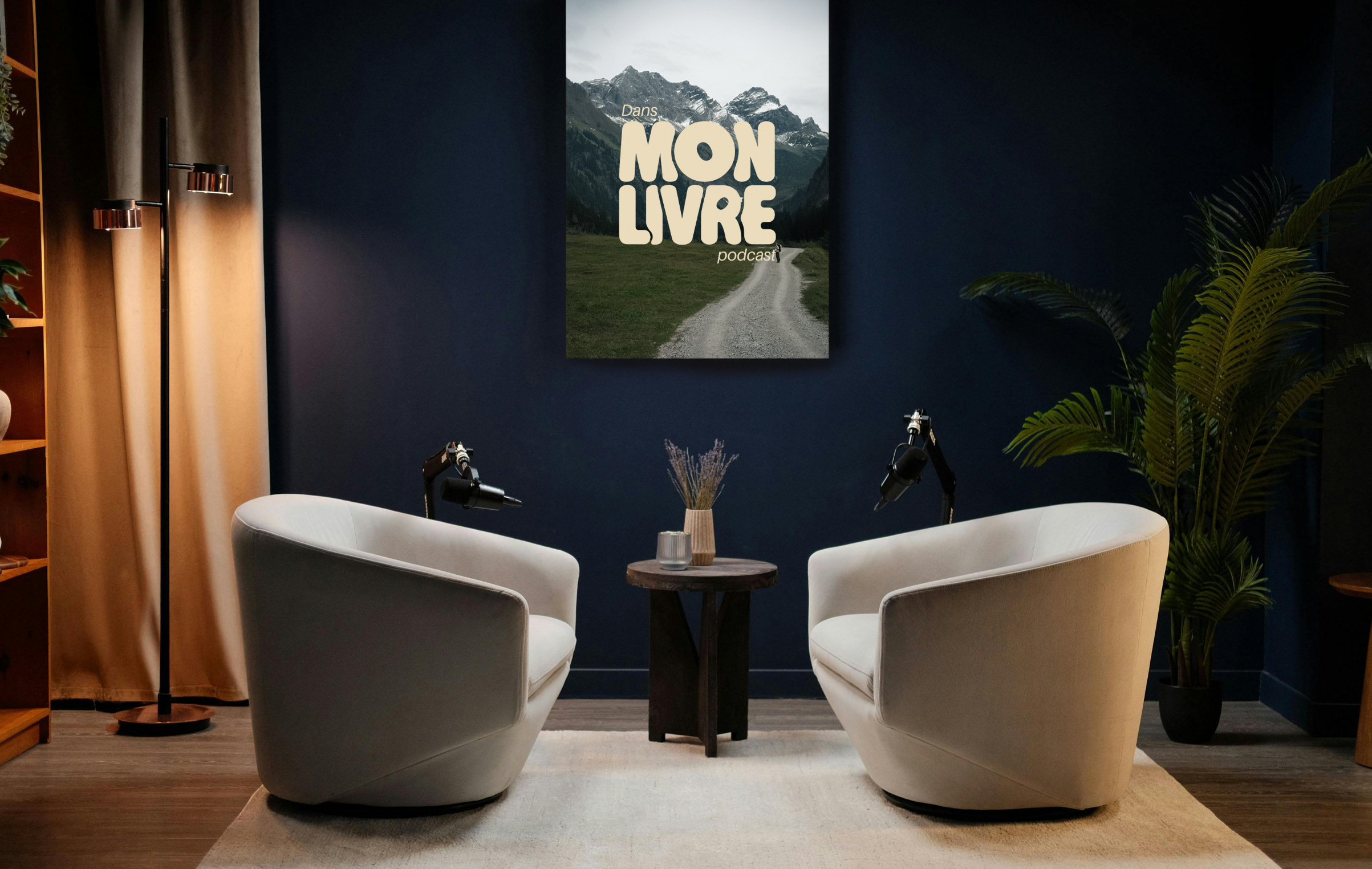
Dans Mon Livre
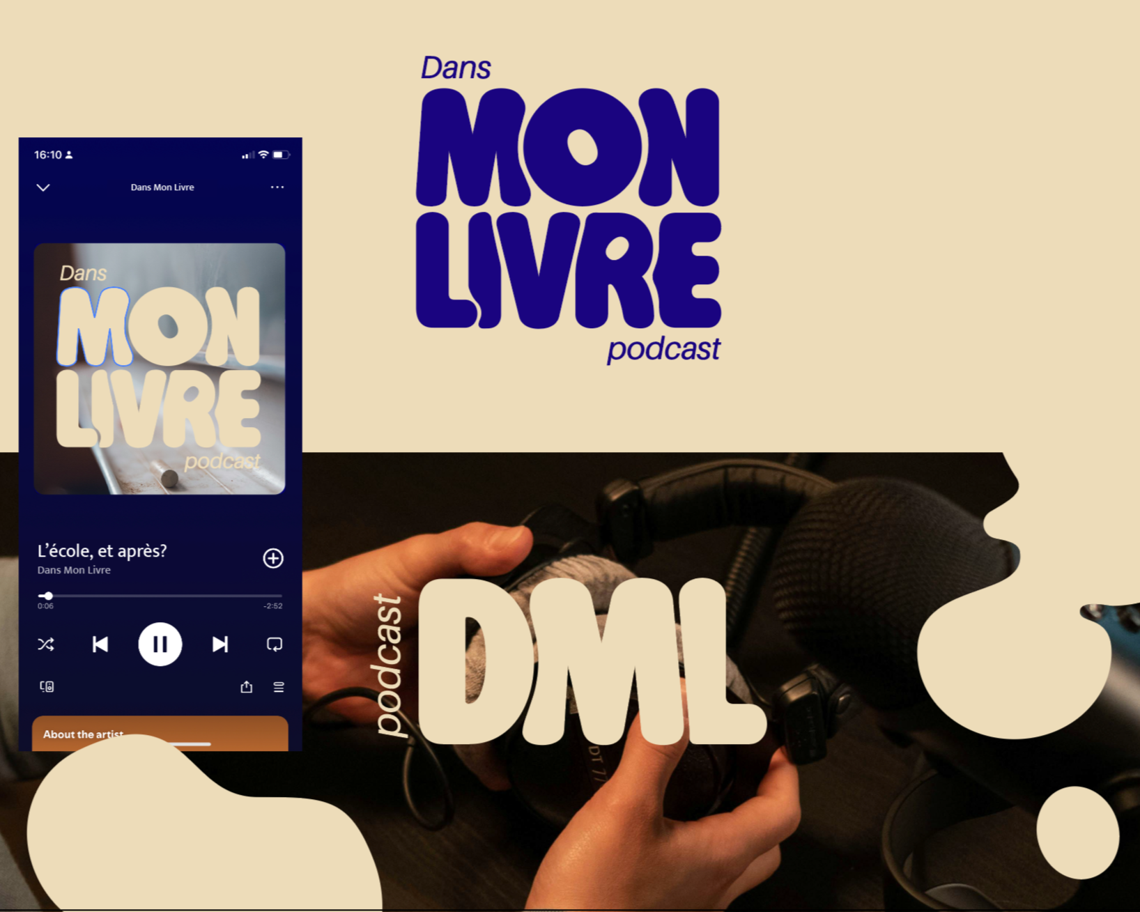
Option 1 (picked by the client)
This direction relies on a bold, rounded typographic logo as the core of the identity. The shapes are simple, friendly and instantly recognisable, creating a very clear and modern visual presence.
Positive points
Easy to deploy across all digital formats
Simple, strong and consistent system
Highly versatile for thumbnails, covers and social media
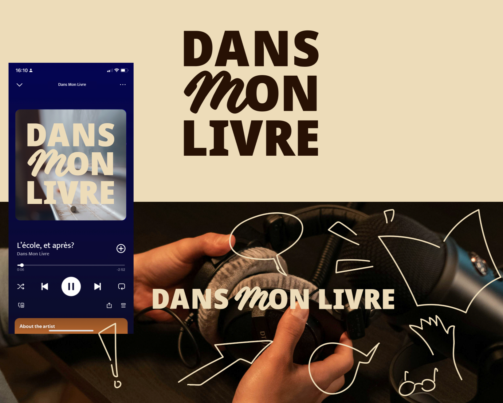
Option 2 (not selected)
This direction focuses on a strong typographic composition combined with hand-drawn illustrations. The contrast between bold lettering and delicate line drawings creates a warm, human, almost intimate atmosphere.
Positive points
Very distinctive and memorable
Strong storytelling and human touch
Visually rich and expressive
Testimonials
"Amazing work, very professional . I 1000% recommend Hermeline."
Catherine Holder, Founder, Kel Production
Audiovisual Producer at SCOR
"She immediately understands the vision of the project and knows how to elevate it by adapting it to the best current trends."
Jérémie Grandin, Founder, Dans Mon Livre Podcast