Charities &
Associations
Here you’ll find projects created for a refuge for retired horses and donkeys, a charity, for the Ellan Vannin Gymnastics Club and for a School called École de la Convivialité in Paris.
Home of Rest for Old Horses
Part 1/2
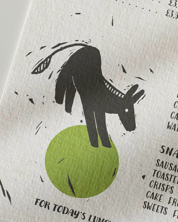
Redesigning the cafe menu
Illustration and graphic design for the new menu of the Home of Rest for Old Horses, based on the Isle of Man, United Kingdom. The visual identity is inspired by traditional linocut techniques, a printmaking process known for its bold lines, tactile texture, and handcrafted feel.
This raw yet gentle aesthetic echoes the values of the sanctuary: authenticity, care, and simplicity. The textured, slightly imperfect shapes and soft silhouettes mirror the character of the retired horses, ponies, and donkeys who live there. Just like them, the visuals carry warmth, honesty, and a quiet charm.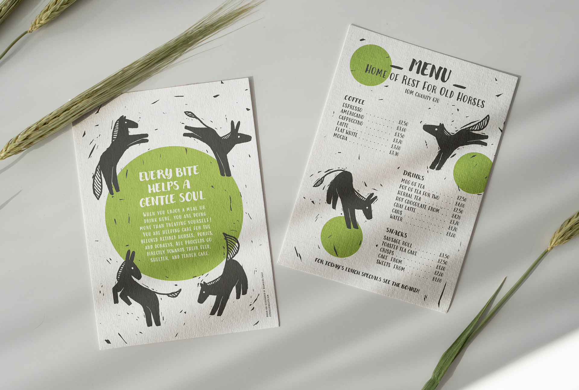
Part 2/2
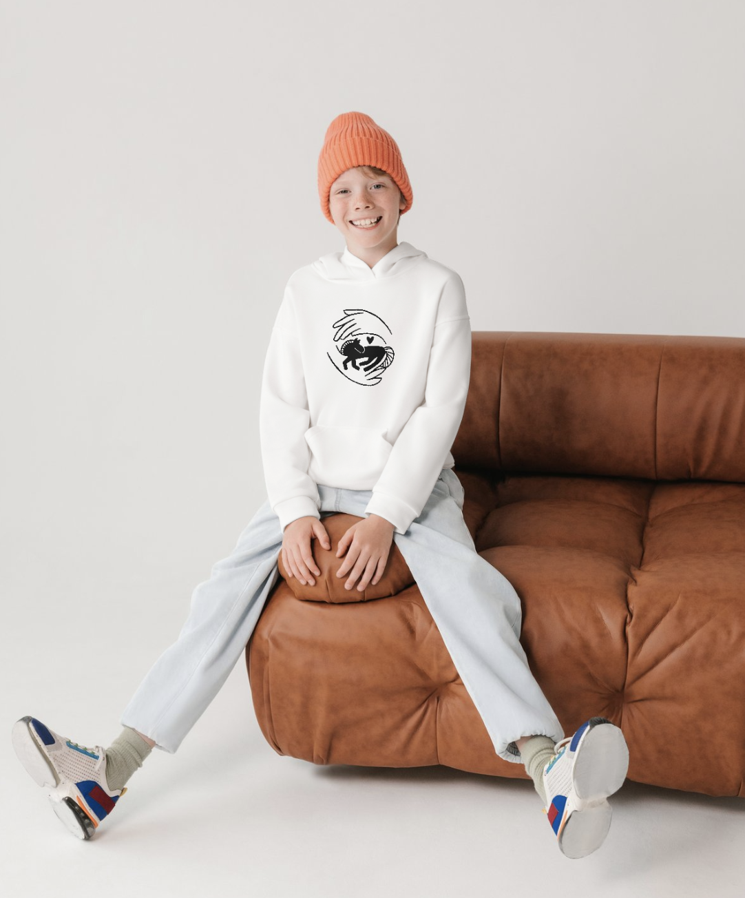
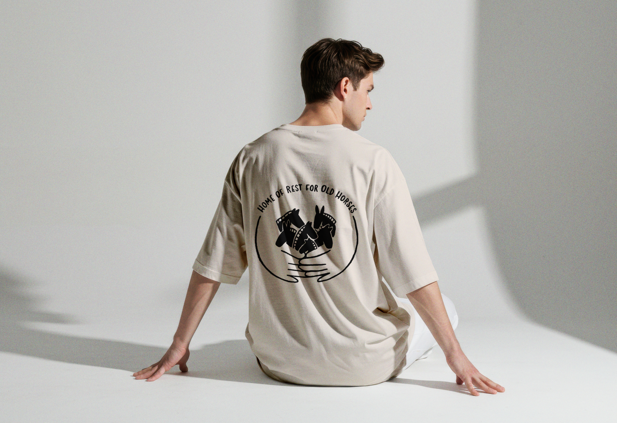
Creating T-shirts for the shop
While designing the menu for the coffee place at the Home of Rest, I realised that extending this new visual identity to other supports could help generate funding while strengthening the sanctuary’s branding. I then created two visual options, soon to be printed by the on-site volunteers on T-shirts and sweat-shirts for both children and adults. These designs allow the identity to live beyond the refuge, helping finance its work and increase visibility.Ellan Vannin Gymnastic Club
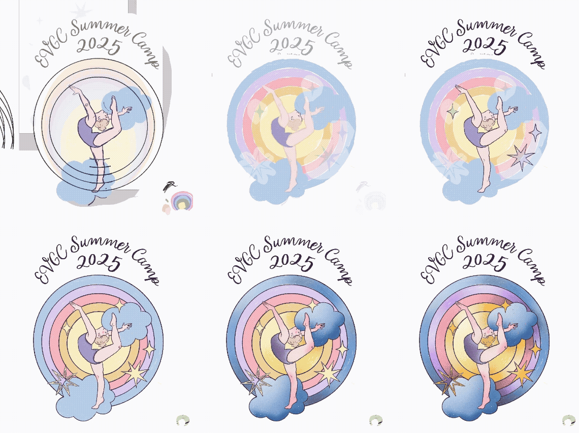
Designing the 2025 Summer Camp T-shirt
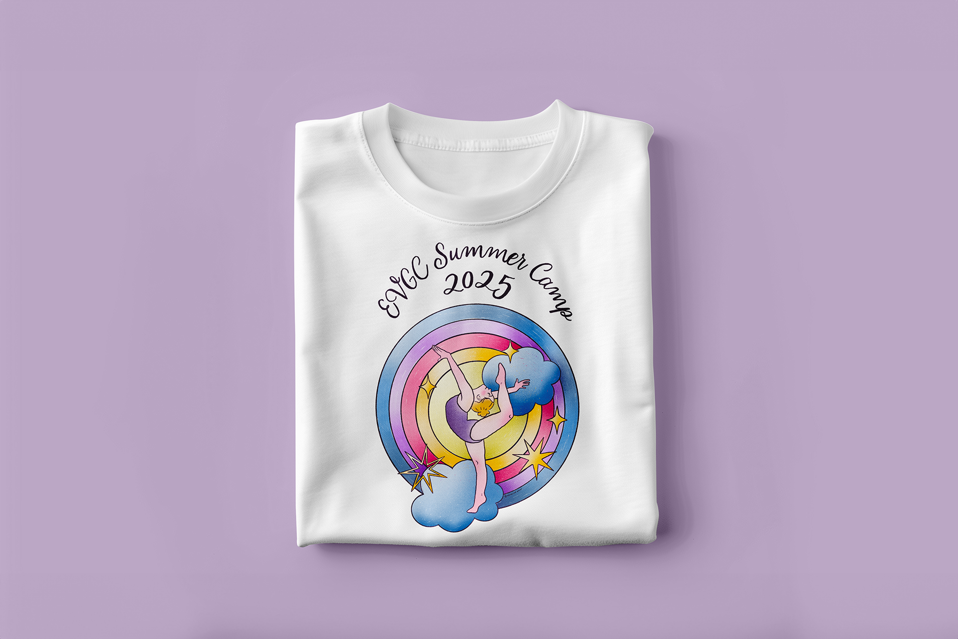
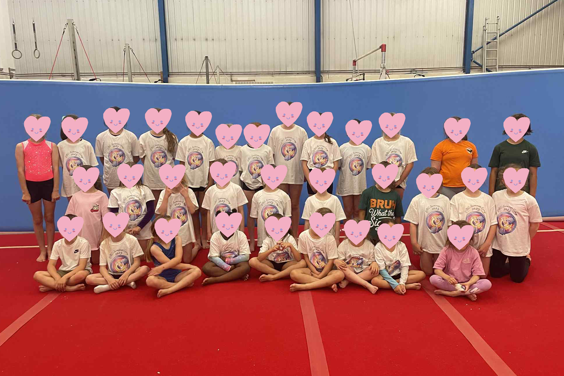
Each year, Ellan Vannin Gymnastics Club, based on the Isle of Man, hosts a themed summer camp. I reached out to their team to propose a T-shirt design for this year’s rainbow theme. As the camps are primarily attended by girls aged 3–7, I created an illustration celebrating movement, energy, and confidence.

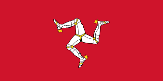
The gymnast’s posture subtly references the Isle of Man’s three-legged symbol (see below).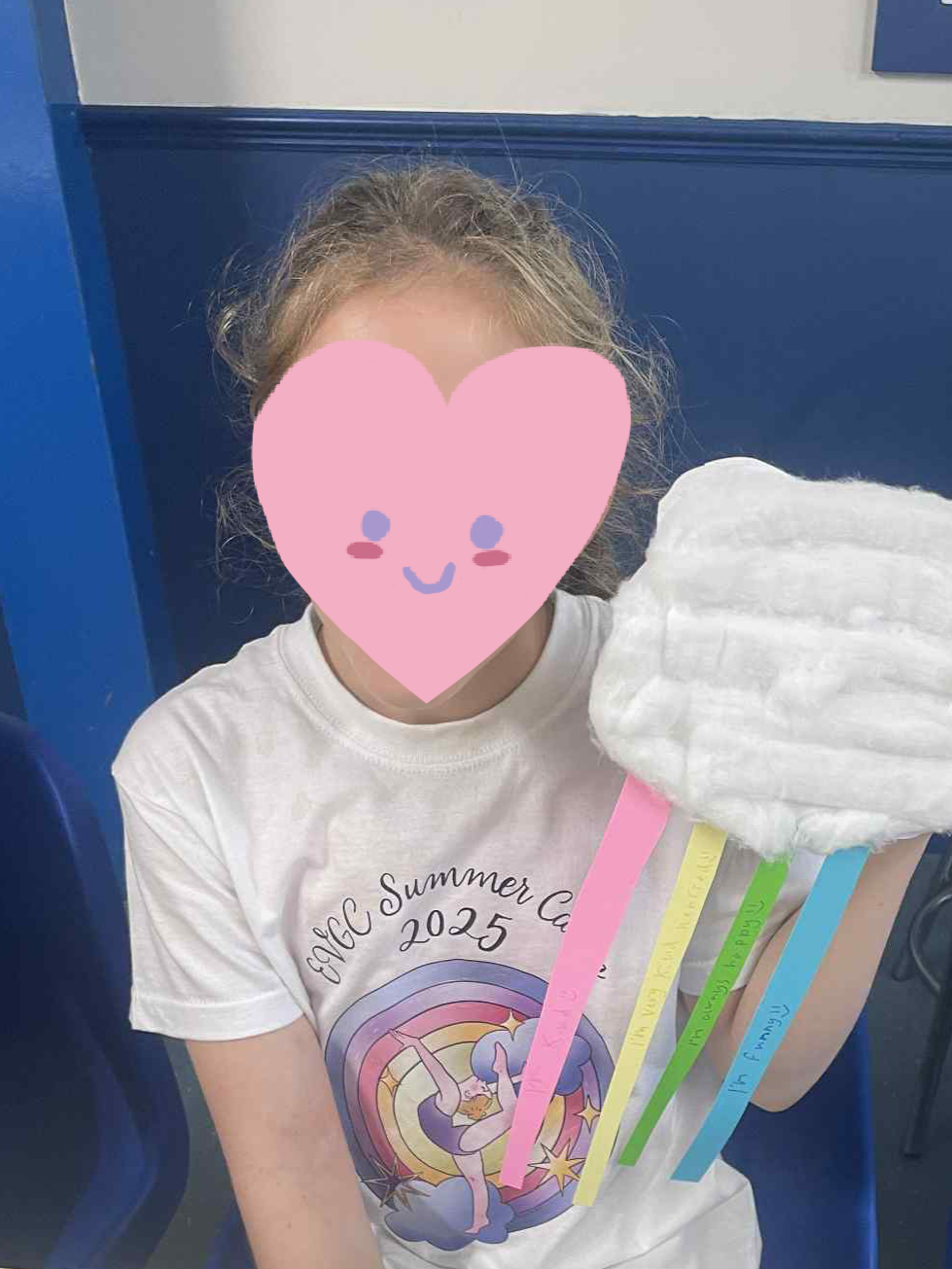
École de la Convivialité
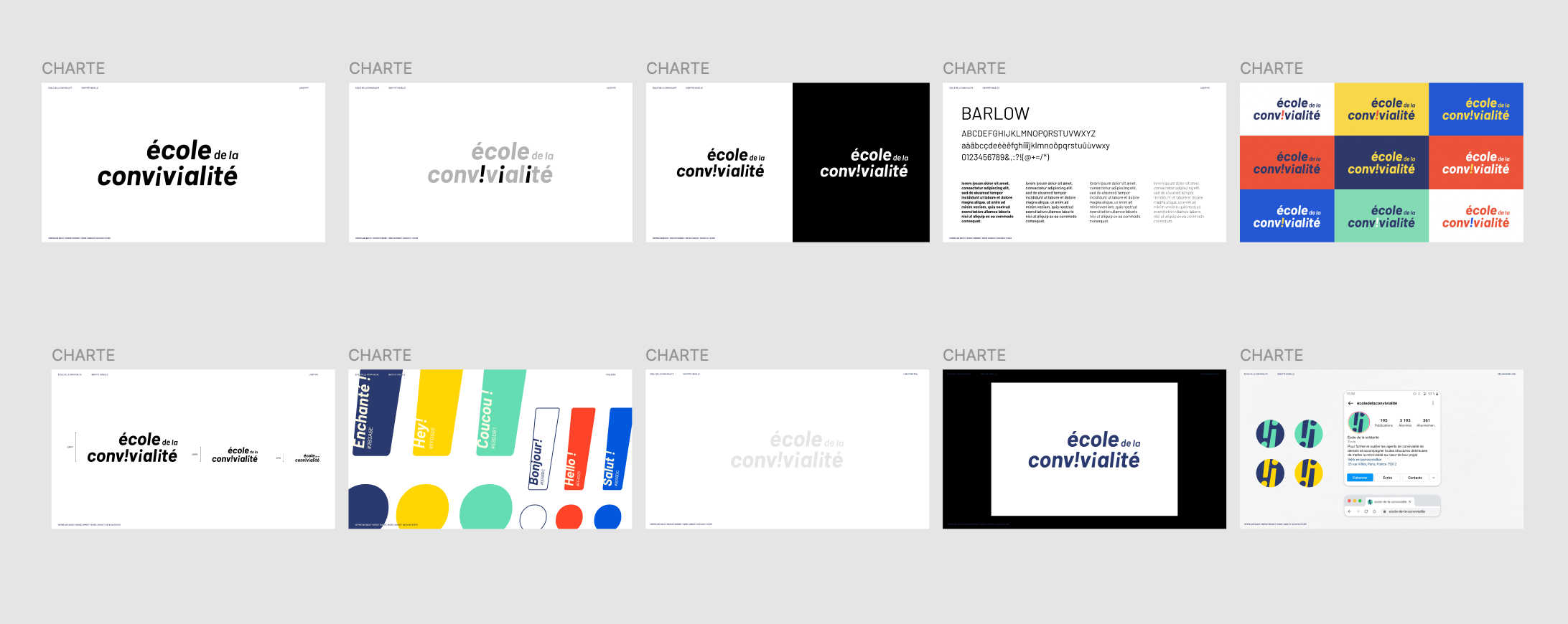
Adapting an existing brand identity to a new project
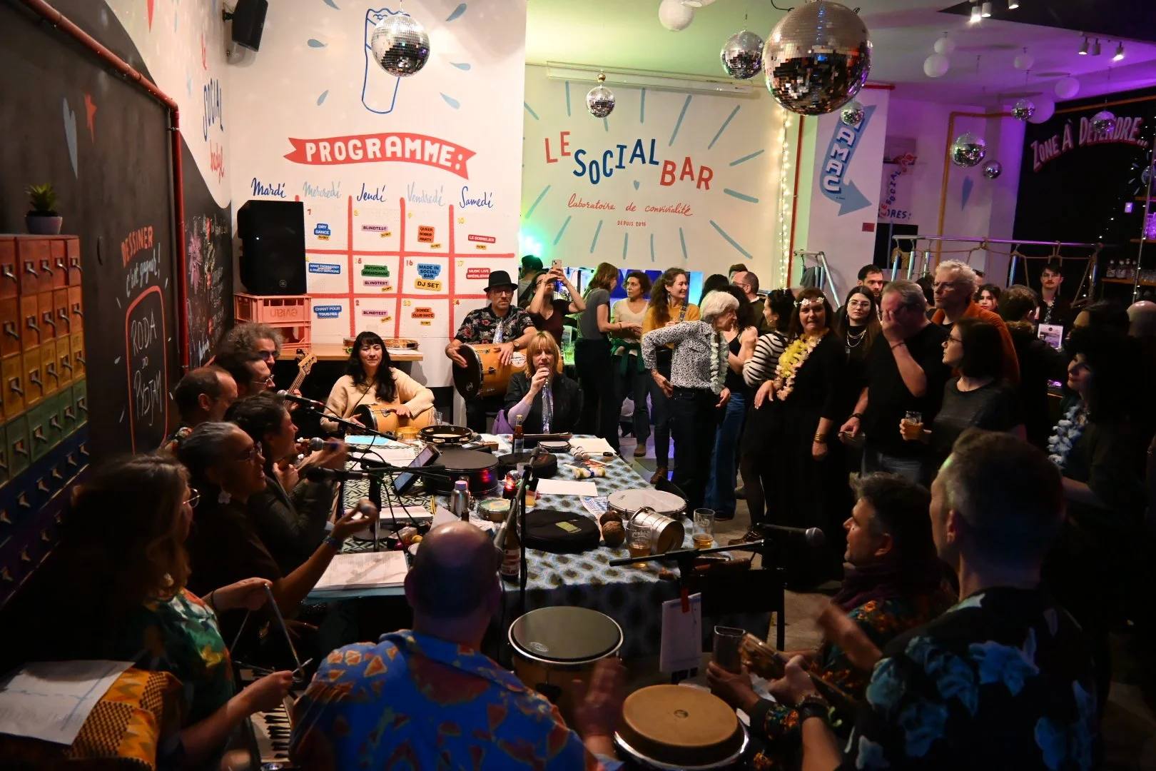
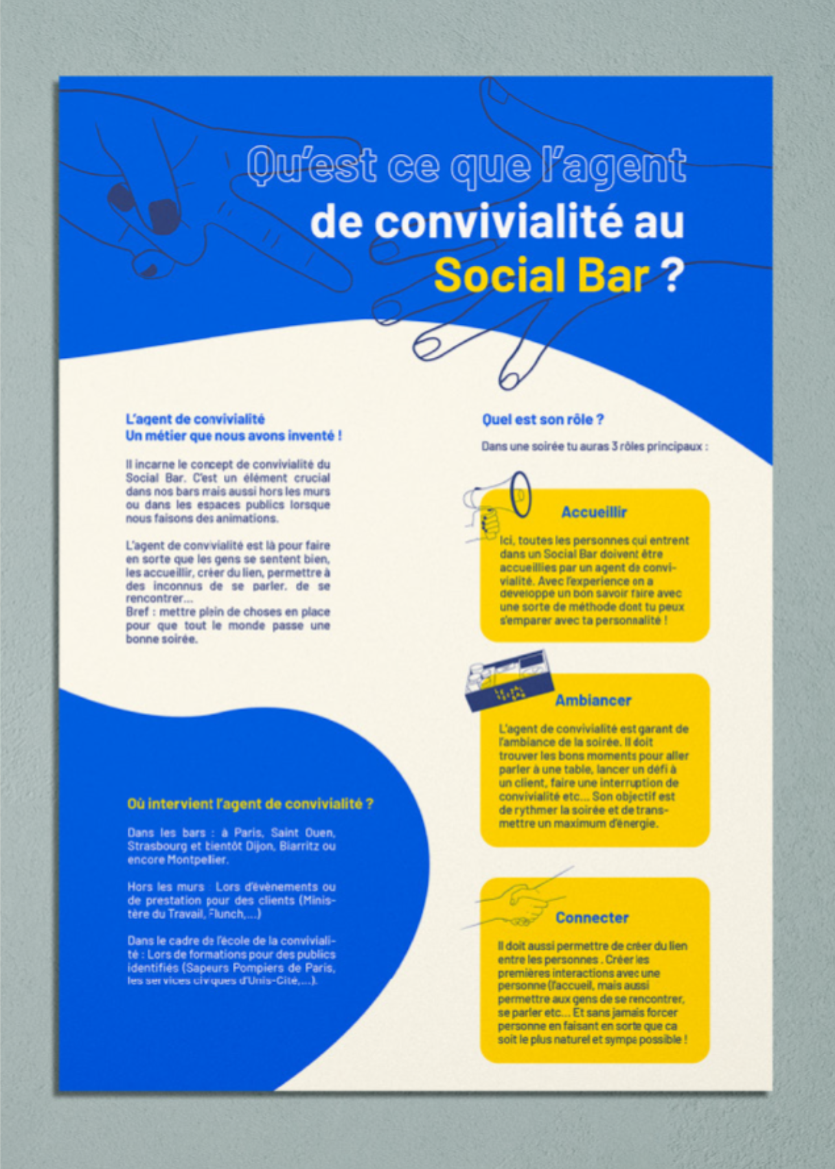
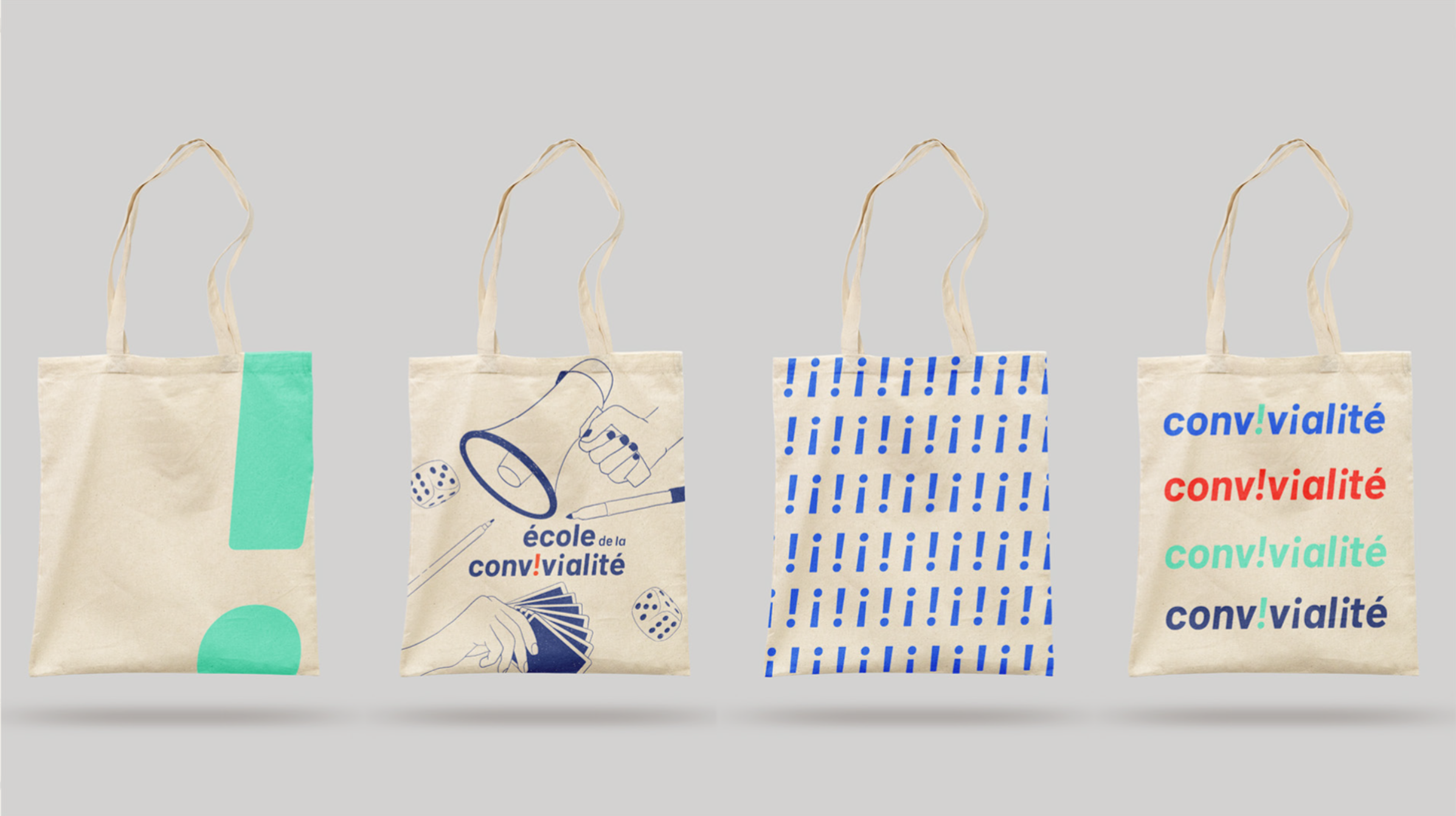
L’École de la Convivialité is a training initiative developed from Le Social Bar, focused on social and professional inclusion through human connection and experiential learning. They commissioned me to design a dedicated visual identity for the school, closely aligned with Le Social Bar’s universe while establishing its own distinctive presence.

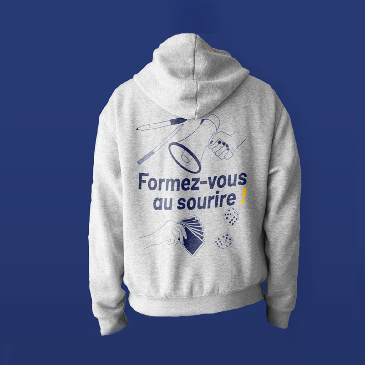
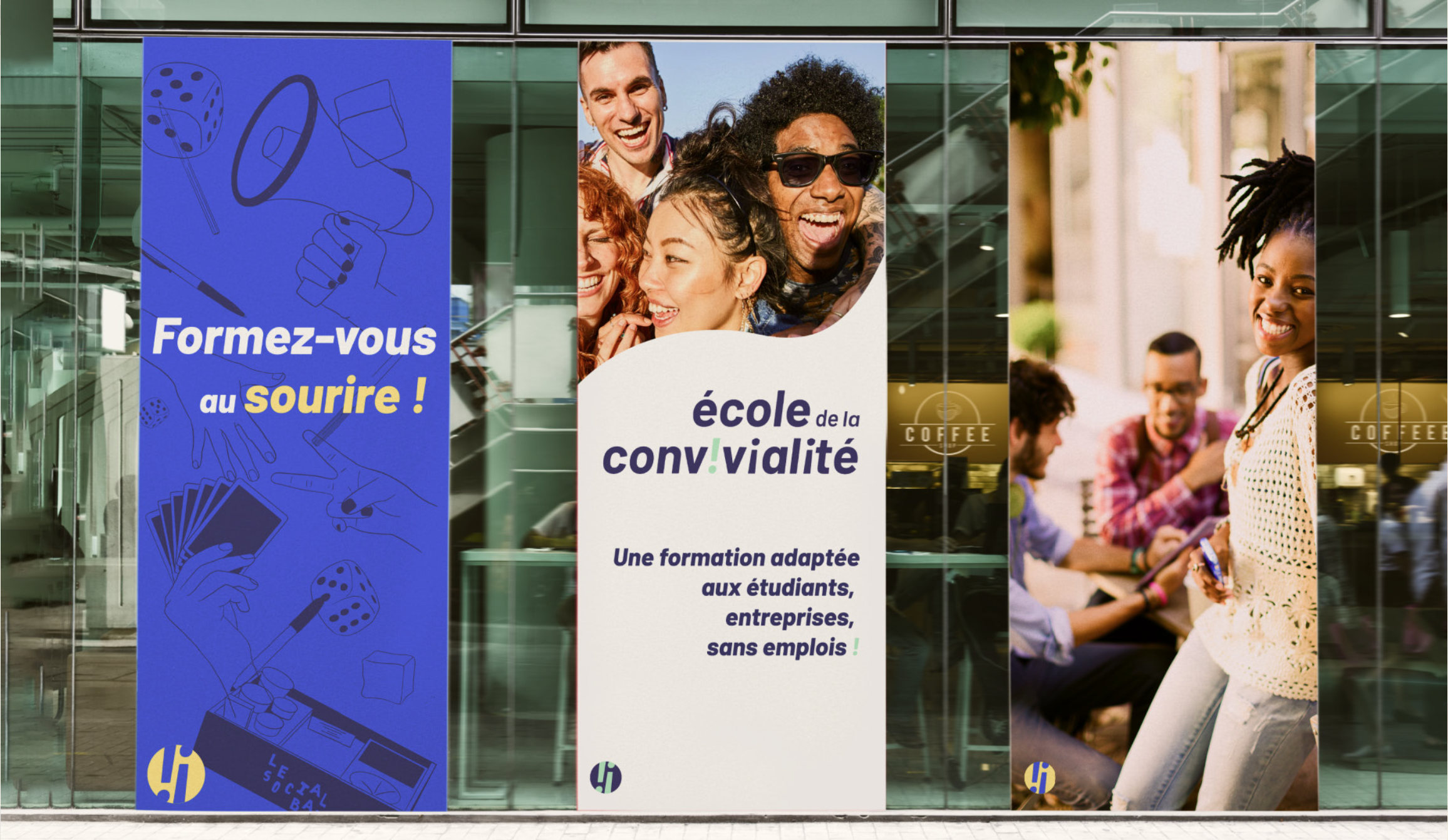
Starting with the creation of the overall visual identity, the next challenge was to adapt it across a wide range of touchpoints, from administrative materials to clothing and educational resources.
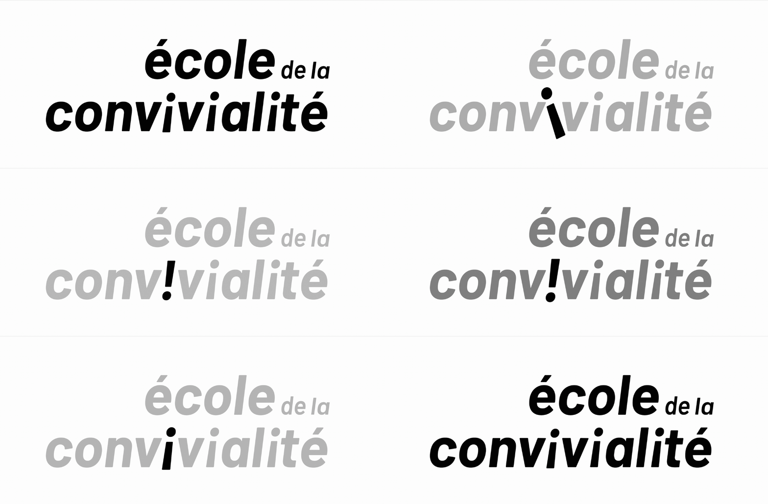
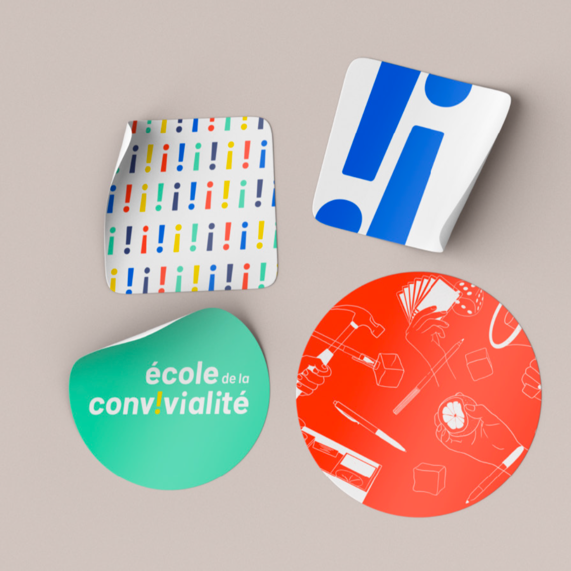
I selected vibrant colours and a playful yet refined logo, featuring an upside-down “i” presented as a “!”, reflecting conviviality itself and emphasising conversation, connection, and joy.

Testimonial
"I wholeheartedly recommend Hermeline for any future endeavors she chooses to pursue. During her time volunteering at our sanctuary, Hermeline consistently demonstrated exceptional dedication and a genuine passion for animal welfare."
Laura Bruder, General Manager, Isle of Man Home of Rest for Old Horses
