Herbaceous
Personal Branding
I’m Hermeline Bacot, and I founded Herbaceous, my studio for branding, art direction, graphic design, and illustration. The name nods to my own name Her from Hermeline, Bac from Bacot, and the inspiration I draw from nature. I create visual identities and design concepts that are original, thoughtful, and purposeful. Whenever possible, I include illustrations, as I believe this human touch adds personality and authenticity to every project.
The process
I always start with hand-drawn sketches, exploring ideas freely on paper. Finding the final concept can take hours or even days, but I value this process, it allows me to experiment and discover the best solution before moving to the computer.
Inspirations:
Creating a moodboard
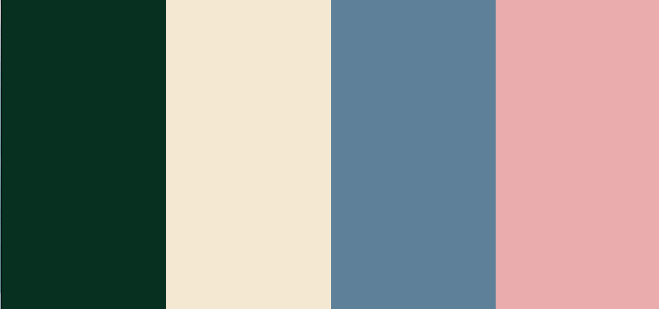
Final Colours
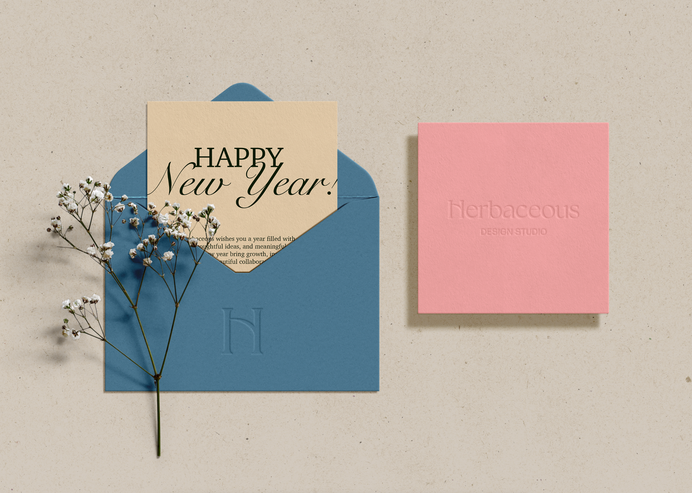
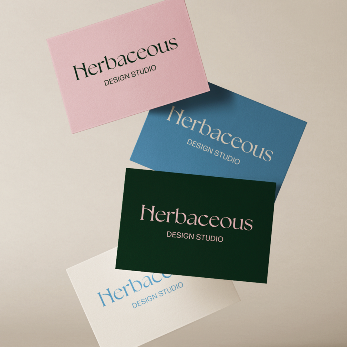
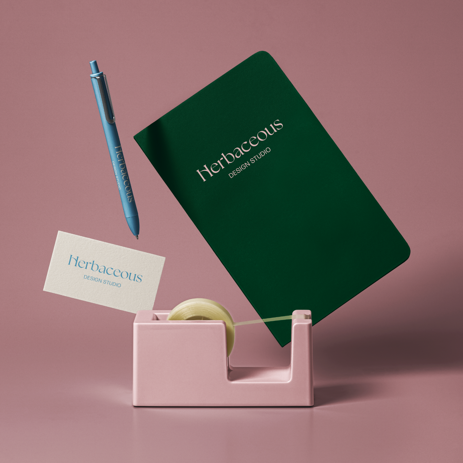
I chose Forest Green, Linen Beige, Stone Blue, and Blush Pink, colours inspired by natural elements, creating a calming and approachable identity.
I wanted the brand identity to reflect my personality and working style. I enjoy taking the time to fully understand the “person” behind each project, believing that the human touch is what truly makes the difference. This is why I opted for softer, more “welcoming” colours.
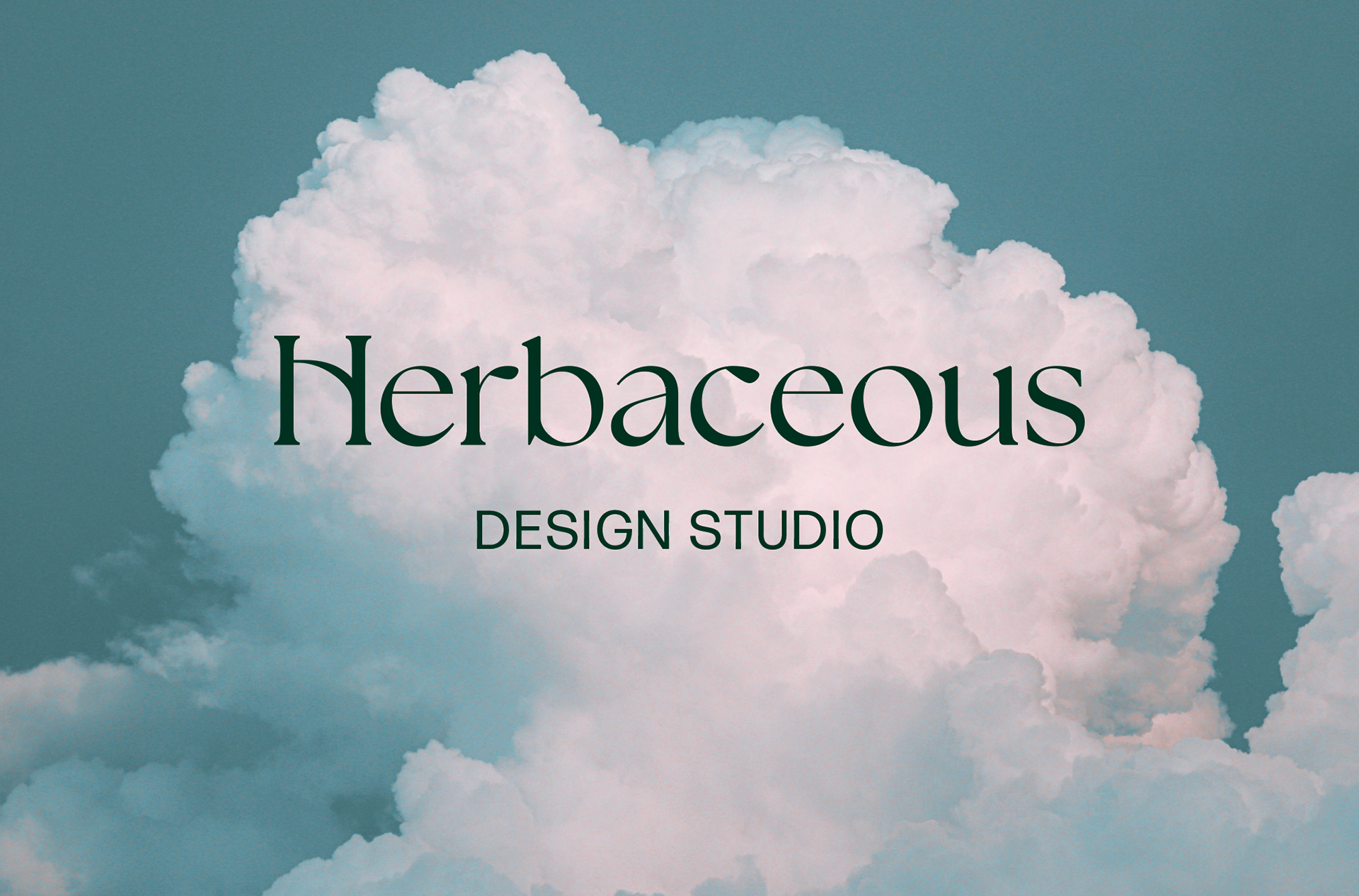
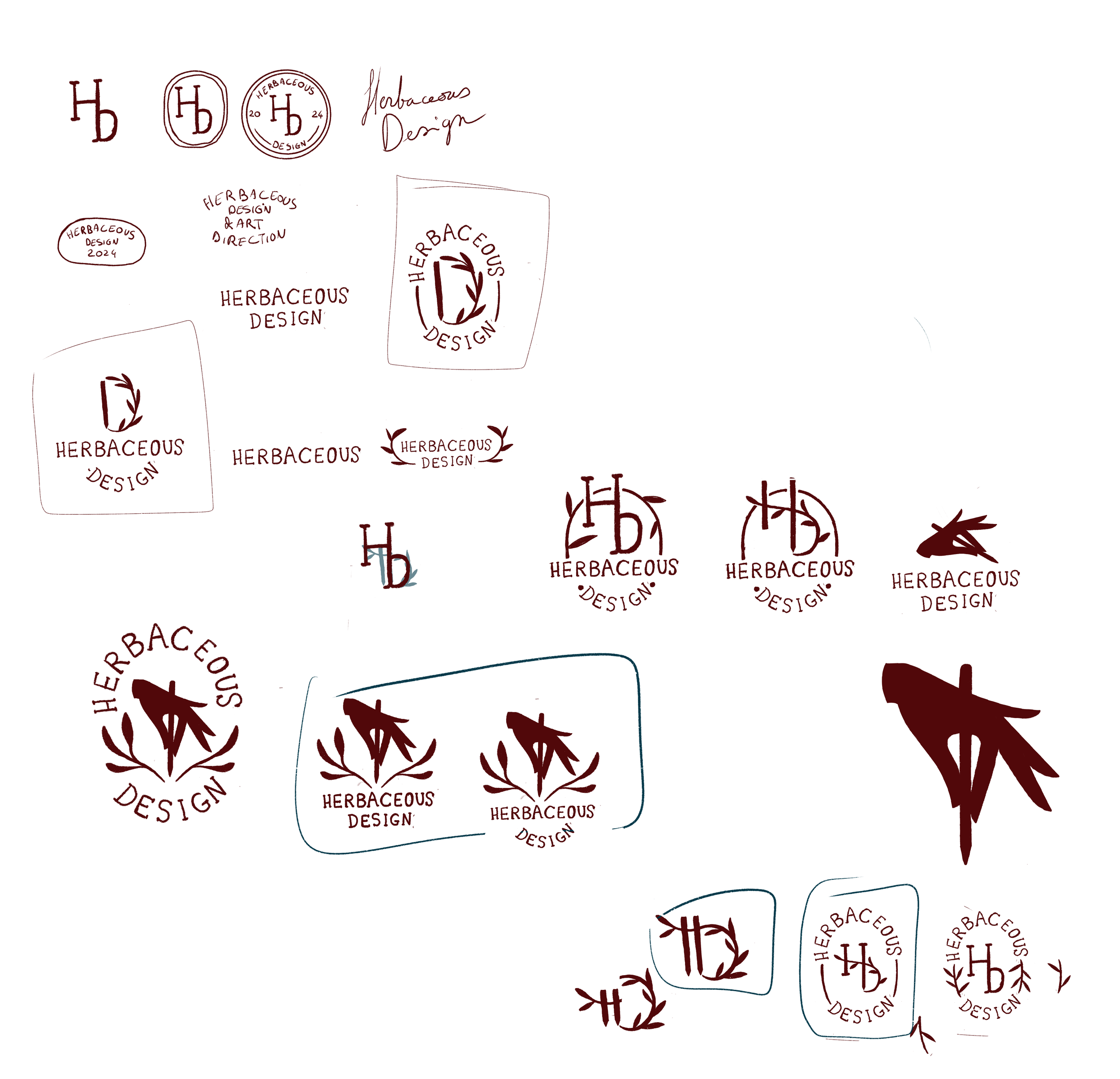
Final Logotype
I explored a wide range of logotypes and realised that defining my own brand identity was actually more challenging than creating one for others.
The Herbaceous logo is delicate and light, leaning towards luxury codes, while aiming to combine the quality of my services with the organic, slightly imperfect curves of nature, reflecting the way I like to work: in a very human, thoughtful, and intentional manner.
Brand Values
Herbaceous is a branding, illustration, and art direction studio built around my values as a designer. I take time to really understand the person behind each project, bringing a human, thoughtful approach to everything I create. The work combines creativity with care, balancing the imperfect, organic curves of nature with a sense of quality and refinement. It’s about connection, authenticity, and making design that feels personal and meaningful.
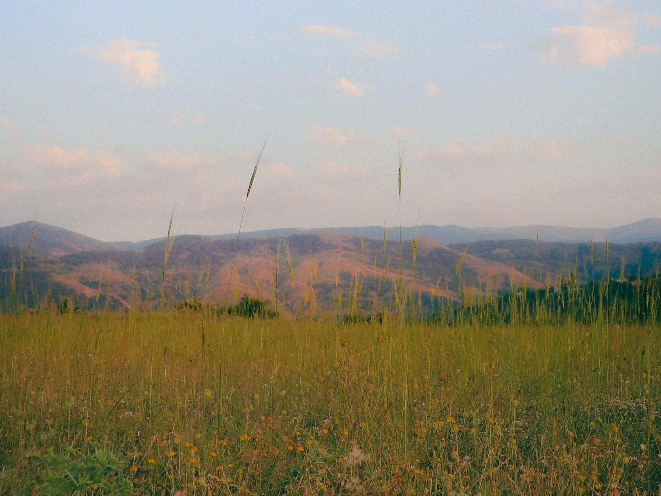
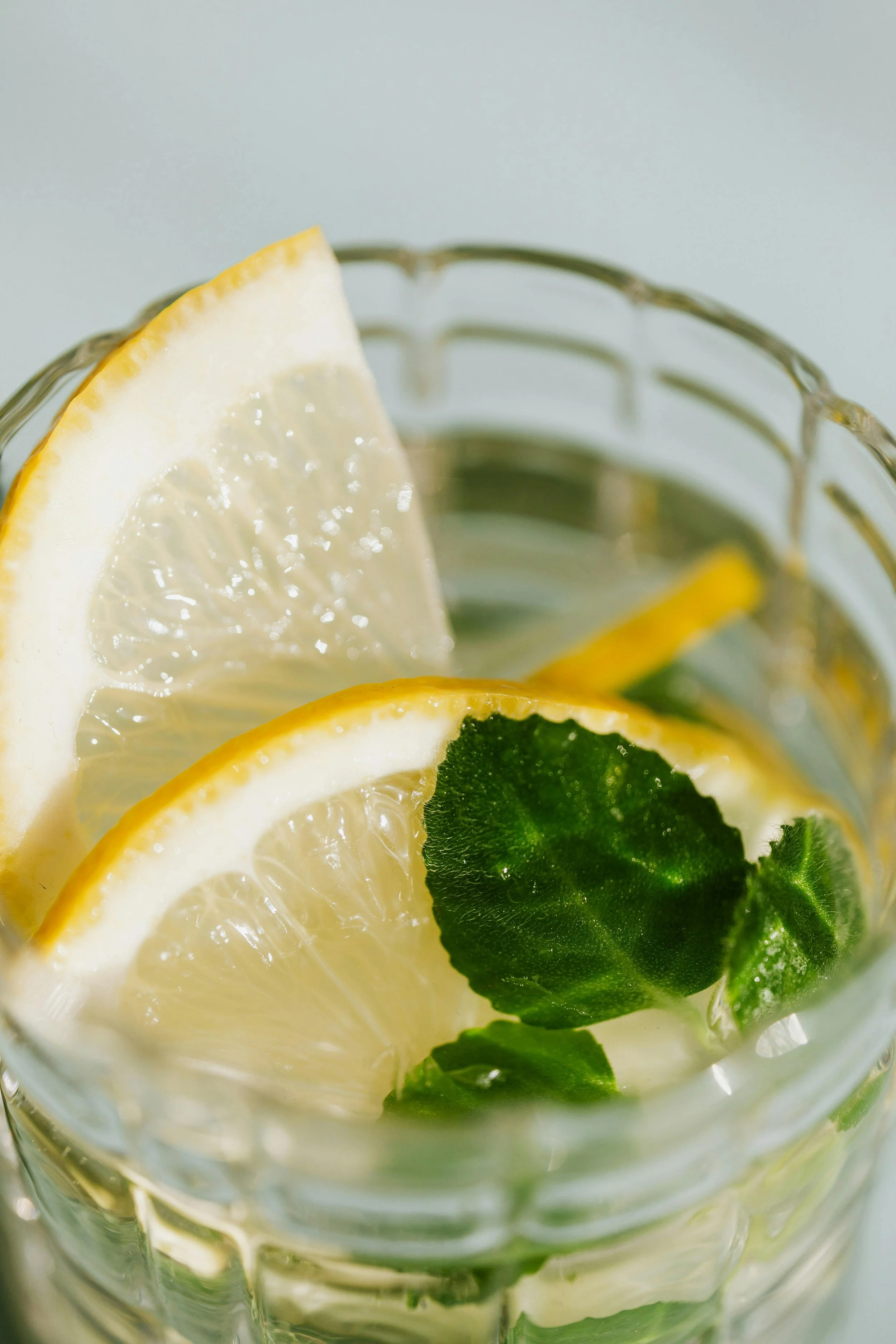
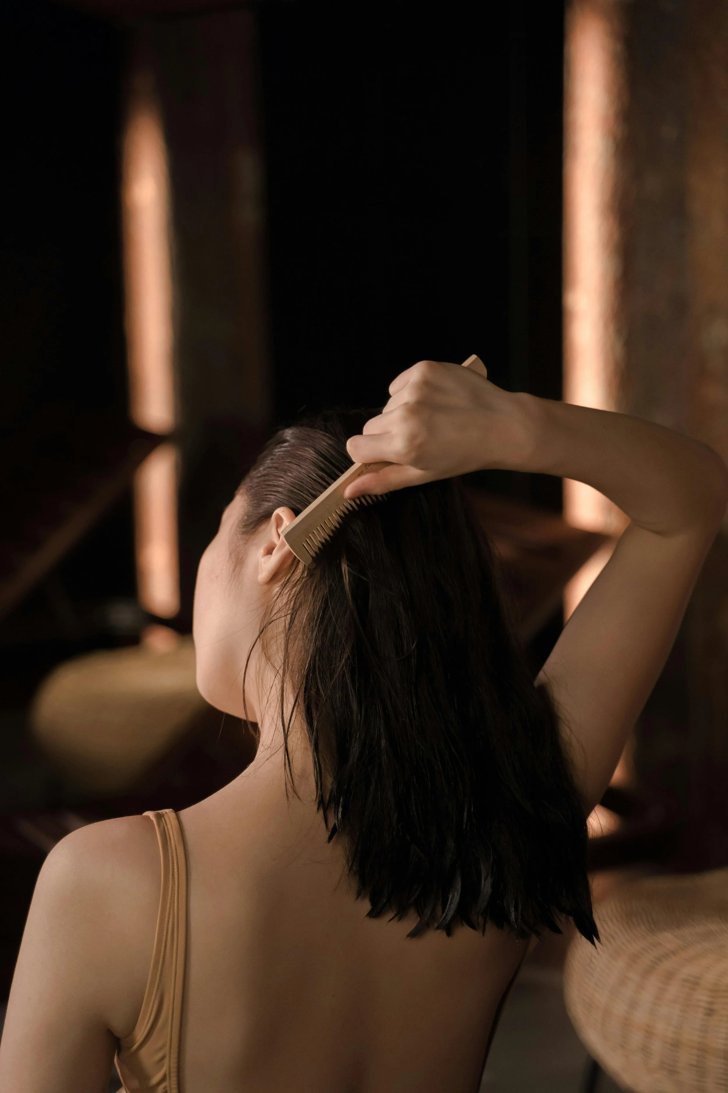
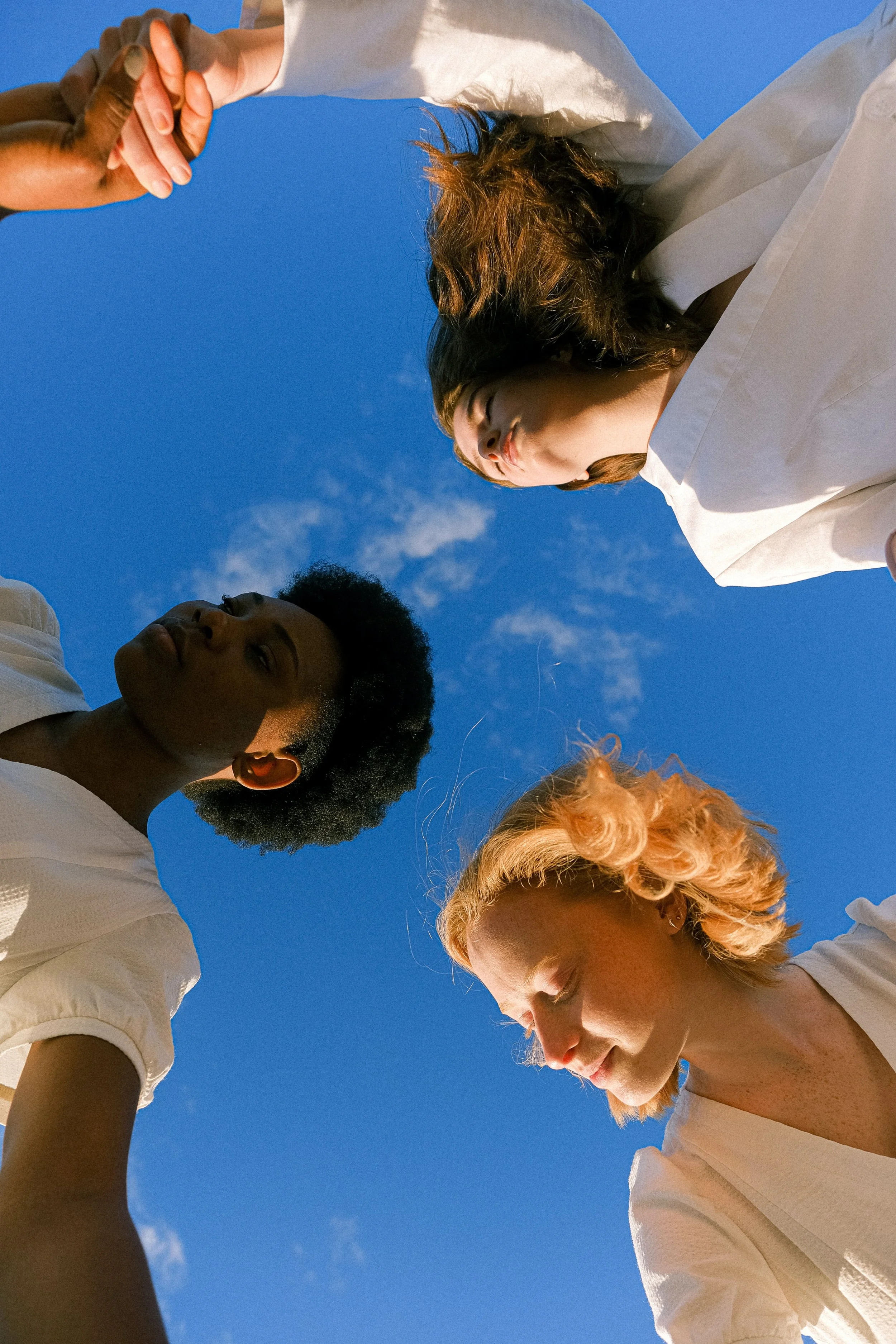
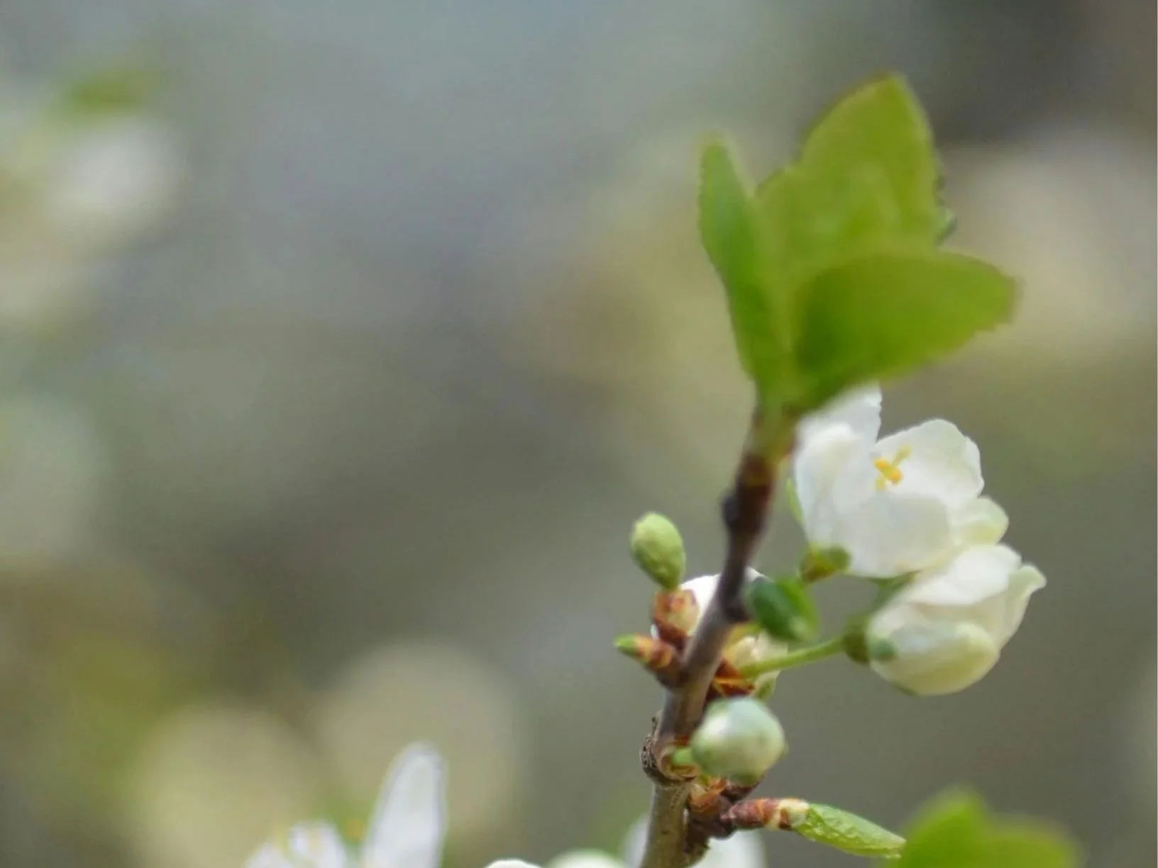
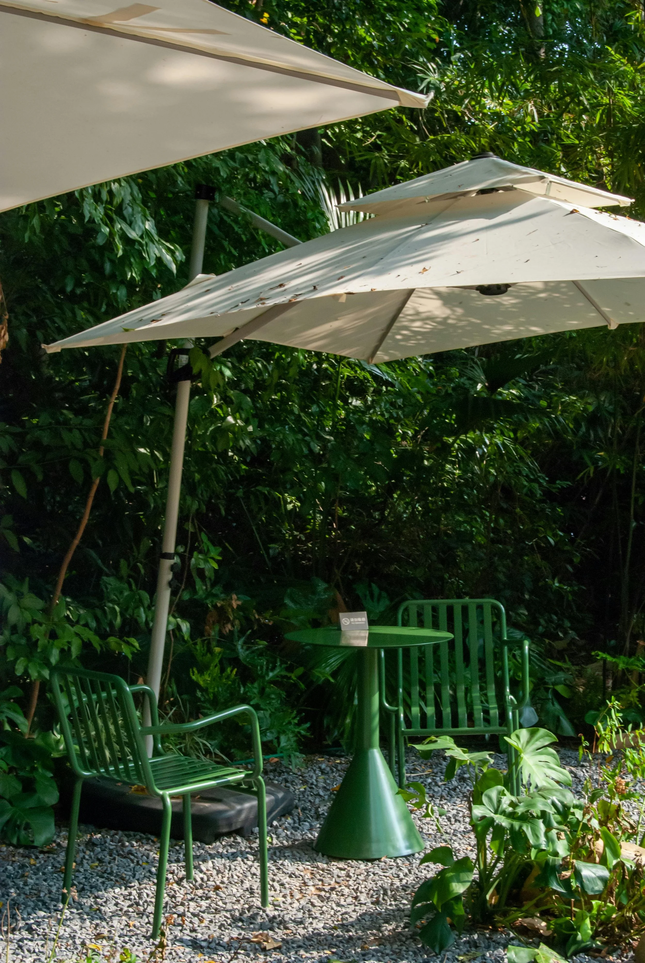
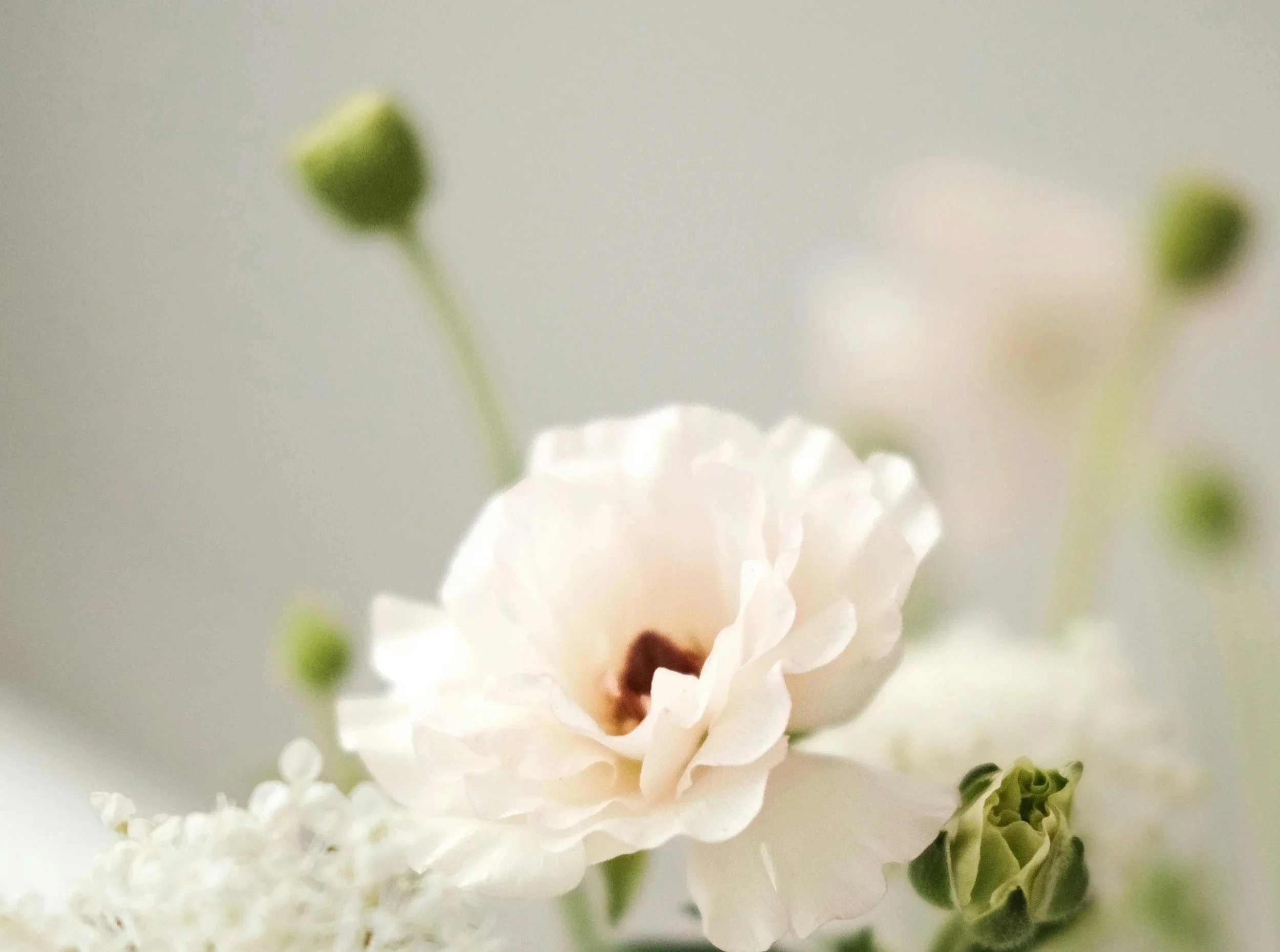
Photography & Visual Style
The visual language uses calm, nature-inspired imagery with soft focus and gentle textures. It’s delicate, uplifting, and approachable, bringing a sense of ease and warmth to the brand’s world. You’ll find this same visual style echoed throughout my work for other clients, reflecting my consistent approach to creating thoughtful, human-centred visuals. (These are examples I picked on image banks).